Truthout is an indispensable resource for activists, movement leaders and workers everywhere. Please make this work possible with a quick donation.
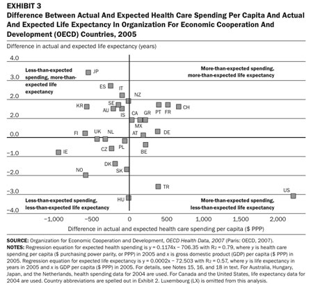
I was looking at OECD health care data for something else I’ve been working on and wanted to share some of it. It’s well known that the United States spends a lot more per person on health care than comparable countries and that our actual health outcomes are anywhere from average to bad. See, for example, this chart from a 2008 paper by Gerard Anderson and Bianca Frogner.
That chart shows how each country’s spending and life expectancy differ from what you would expect based solely on how rich they are (per capita GDP). As you can see, we spend a lot more and live a lot less. (That paper also considers a number of other outcome measures; we do well on some, poorly on others.)
Besides where we are today, though, the other thing we should be interested in is where we are going. Our health care system is the product of a number of historical factors that we can’t make go away with a snap of our fingers. So even if we have a bad, expensive health care system, maybe it is getting relatively better and relatively less expensive.
Nope.
This chart, from the OECD data, shows the change in each country’s per capita spending and life expectancy relative to all other countries. The data are standardized: you’re looking at the number of standard deviations each country was away from the mean in 1992 and in 2007.*
You can see that not only is the United States the outlier when it comes to spending, but we are moving in the wrong direction: we are becoming more of a spending outlier, and we are drifting down from the average life expectancy into the lower group (currently surpassing only Turkey, Hungary, Mexico, Poland, and Czech Republic).
I labeled a few of the other outliers. Basically the lower left is relatively poor countries, Japan is at the top, and that big cluster is Western Europe and the Commonwealth countries.
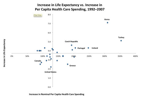
Another way to look at the situation is to look at actual values rather than standard deviations, as in the following chart. This one shows you actual increases in life expectancy and percentage increases in nominal per capita health care spending. The axes are located at the averages of these countries: the average spending increase was 132 percent and the average life expectancy gain was 3.7 years.
One thing you can see is that, in percentage terms, health care costs have not been growing in the United States much faster than in other comparable countries.** If you exclude countries starting with a small 1992 base (Korea, Turkey, Ireland, etc.), our rate of health care cost growth has been above average, but it’s not an outlier. So the reasons why our health care costs are growing rapidly are probably at least somewhat different from the reasons why they are high to begin with.
The other thing you see is that our life expectancy gain was the absolute lowest of the whole group (and we weren’t starting from a particularly high level, as you can see in the previous chart).
Ordinarily, you would think there should be convergence across countries. Since other countries spend less and live longer, you would think that we would learn from them—global competition, you know. But instead we’re moving the wrong way on both dimensions.
* I picked all OECD countries for which there was data, except Belgium (which has a different methodology for counting spending), which meant dropping Chile, Estonia, Israel, Luxembourg, Slovak Republic, and Slovenia. I only went back to 1992 because Germany has a gap in 1991 and I initially planned to use all the intervening years. I stopped in 2007 because Canada and Greece are missing data for later years.
** We had below-average growth in percentage terms, yet the number of standard deviations separating us from the mean increased, because the poorer countries increased spending rapidly; this convergence caused the standard deviation to fall as a proportion of the mean.
An urgent fundraising appeal: 5 Days to raise $34,000
Thank you for reading Truthout today. We have a brief message before you go —
Unfortunately, donations are down for Truthout at a time when media is under immense pressure. Trump is arresting journalists, Big Tech is censoring independent news, and economic conditions for media have been worsening for years.
Simultaneously, movement media is vital in the fight against Trump’s authoritarian reign. Our mandate to tell the truth, share strategies for resistance, and speak against fascism is ever more urgent in this deluge of political censorship. Yet, we are struggling to meet our publishing costs when our work is so urgently needed.
If you can support Truthout with a one-time or monthly donation, you will make a significant impact on our work. Please give today during our fundraiser (5 days left).


